Orthofix Web Redesign

Overview
Following a company-wide rebrand focused on putting patients first, I led the redesign of Orthofix.com to align the digital experience with the new brand vision and messaging.
My Role:
I redesigned key areas of the website using analytics and user behavior data to identify opportunities for improvement. By enhancing navigation, visual storytelling, and content hierarchy, I created a more engaging experience that helped patients find information more easily while supporting business objectives.
What it Used to Look Like
My team and I were tasked to completely overhaul the old website to address the following issues:
- Outdated and cold imagery
- Targeted more towards doctors than patients (main visitors)
- Not mobile or tablet friendly
- Navigation was confusing and hard to use
- Outdated content and not optimized for SEO
- Layout was not built to scale

A Fresh Look, an Improved UX & UI
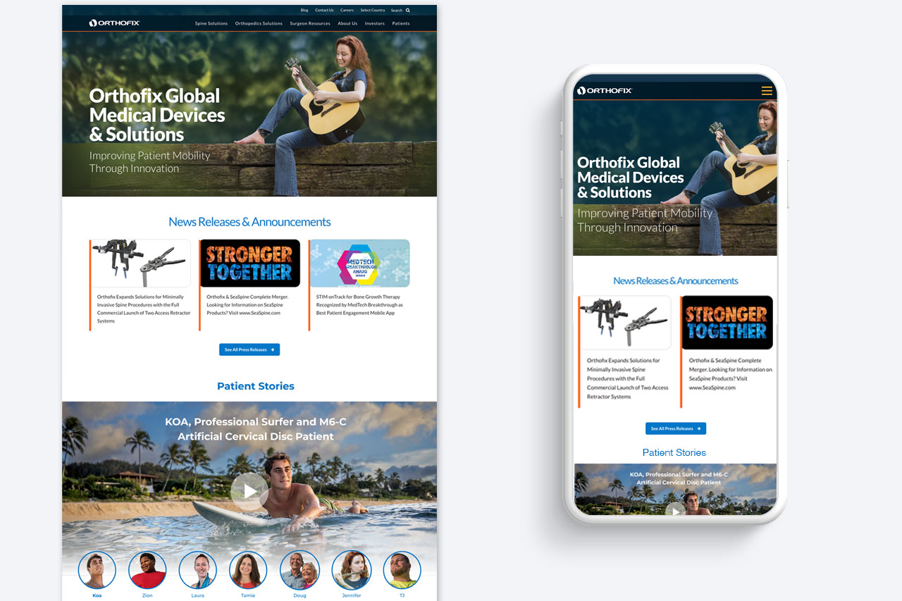
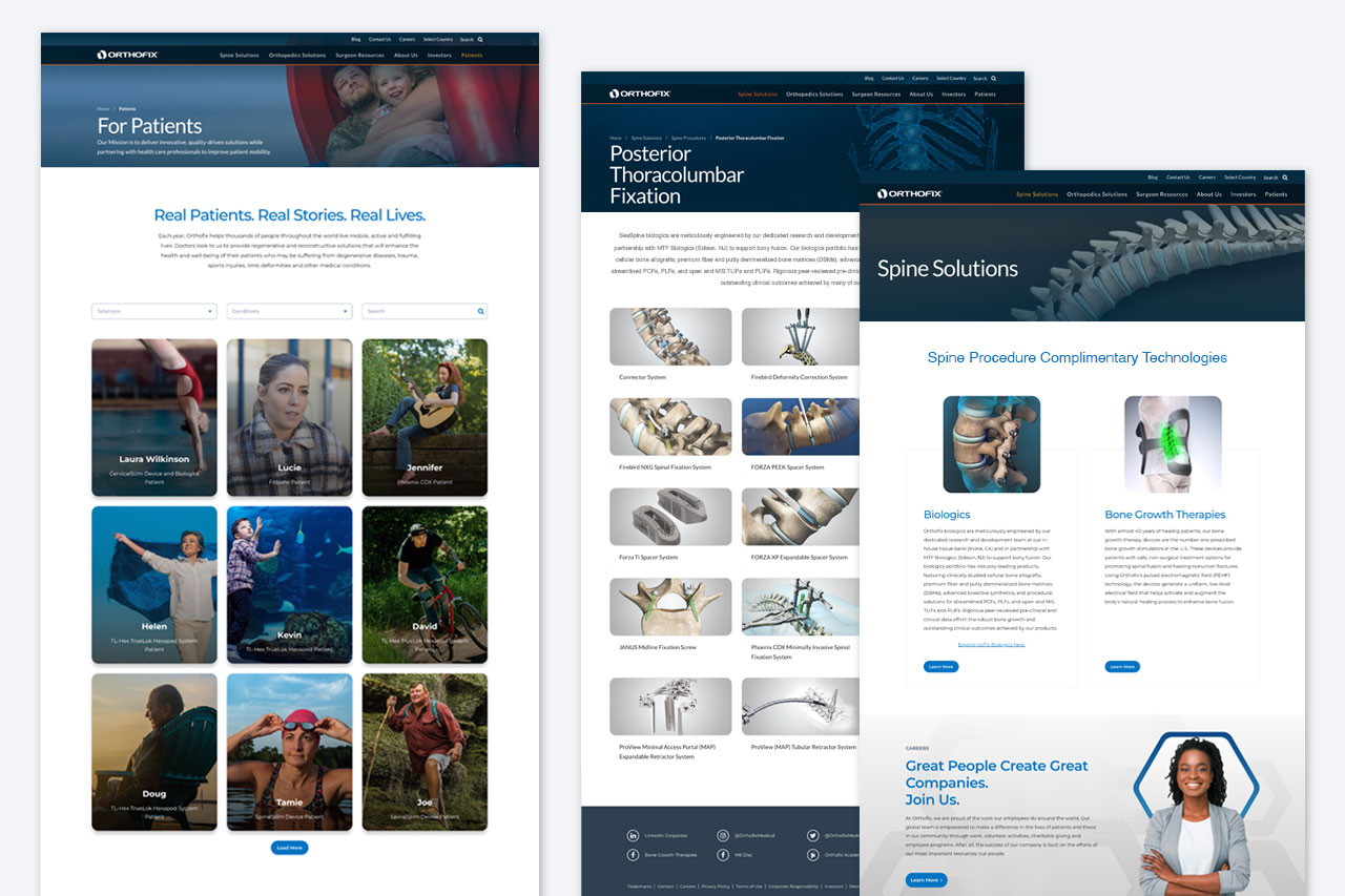
We redesigned the corporate website by streamlining layouts, refining icons, reducing overall copy, and consolidating low-traffic pages. To meet the high production volume and a tight deadline, we created components in small batches, uploaded assets continuously, and conducted thorough testing in our sandbox—resulting in a smooth launch with minimal bugs and a robust component library. All our efforts produced a more cohesive, efficient, and user-friendly website.